
Connections Academy
As online education continues to grow, many prospective learners remain skeptical about the effectiveness of virtual learning. My goal was to improve trust and conversion by redesigning the experience through a research-driven UX process. I conducted user research, usability testing, and comparative analysis between the existing (control) and redesigned (experimental) experiences to validate design decisions. The resulting solution enhanced the user experience and helped increase qualified leads.
ROLE
UI Design
UX Research
Redesign
Front-end coding
AB Testing
TEAM
UX team of 2
CLIENTS
Connections Academy
TIME
2014-2018
(every 2-4 weeks)

Design Challenge
Connections Academy's homepage featured a large hero image that occupied most of the above-the-fold space, limiting the visibility and prominence of key messaging. A primary design challenge was determining how to make the call-to-action (CTA) more noticeable and compelling without disrupting the visual hierarchy of the page.

Solution
I redesigned the homepage using a landscape-oriented hero image to create more space for key content and improve the visual balance above the fold. To increase the visibility of the primary call-to-action (CTA), I introduced an accent color that contrasted with the primary brand palette while remaining visually cohesive with the overall design.
For mobile users, I also implemented a persistent floating CTA at the bottom of the screen, ensuring the primary action remained easily accessible throughout the browsing experience and reducing friction in the conversion flow.
Experiment
I created multiple experimental design variations and evaluated their performance through A/B testing using Monetate. Over several weeks, I monitored live analytics to measure user behavior, compare conversion performance, and validate which design improvements delivered the greatest impact.

Changed to a landscape image
Redesigned a CTA with a different shade
Added an additional CTA
OLD
NEW
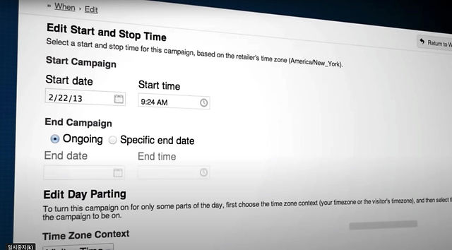
Monetate AB Testing Set-up Demo (Not actual testing recording)
Final Look
After the experimental design consistently outperformed the control over an additional two weeks of live analytics, I promoted the winning variation to production. This phased rollout ensured the final design was backed by sustained user engagement and measurable performance improvements.

Page redesigns using AB testings led to exceeding our D2C (direct to conversion) goal by 60.3% and lead-to-app conversion by 40.6% in 2017.
